2 Descriptive statistics
This section focuses on the exploration and visualization of the data.
2.1 Population
First, looking at the gender of clients, female represents the 55% of the customers, male only the 42%, while the remaining consists of customers that did not answer.
Figure 2.1 shows the count of observations of male and female for each age class.
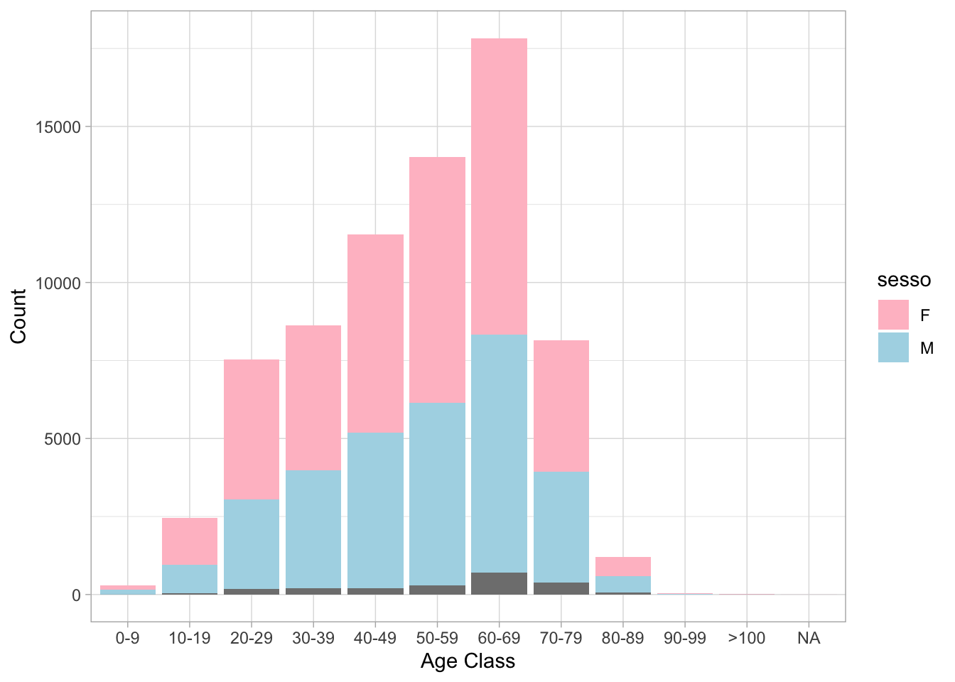
Figure 2.1: Histogram of age classes and gender
As highlighted before, the proportion of female is slightly greater that the male one for each age class, but it is in general a balanced population. Considering the age, instead, the majority of customers are middle age, between 40 and 70 years old. This was also expected, although it is interesting to see that there is a particularly high percentage of people in the class 60-69, maybe due the fact that they have more free time. Other interesting results comes out from this plot. There are some very young customers, between 0 and 9 and a few are older than 90.
2.2 Territorial distribution
To study a service that is by construction linked to the territory, like a museum membership, it is essential to understand where customers live. We divided the analysis, looking specifically at the region where the membership is used, but considering many customers live outside the region we also carried out a macro-analysis on all the Italian provinces.
Most of the customers (68%) live in the region, and in particularly 64% live in the main municipality.
The last map shows that the remaining clients live in almost all of Italy, with greater observations in regions bordering the association’ region. As for the rest, we have an homogeneous distribution in pretty much all the provinces, with some cases with no observations.
2.3 Subscription
In the dataset are present different type of subscriptions. It doesn’t contain specific information about the reductions, although some are self-explanatory. It is clear that some of those are reserved to specific categories, like students and people above 60 years old. The discount type refers to the NGOs that provide the discount, if any. The most common reductions are “Abbonamento Musei” and “Abbonamento Musei Ridotto”. Those two alone account for almost 75% of all the subscriptions. It is difficult to understand only from the data the correlation between the type of reduction and the price of the subscription because there are different prices for the same type of reduction. In Figure 2.2 are shown the count for each subscription type.
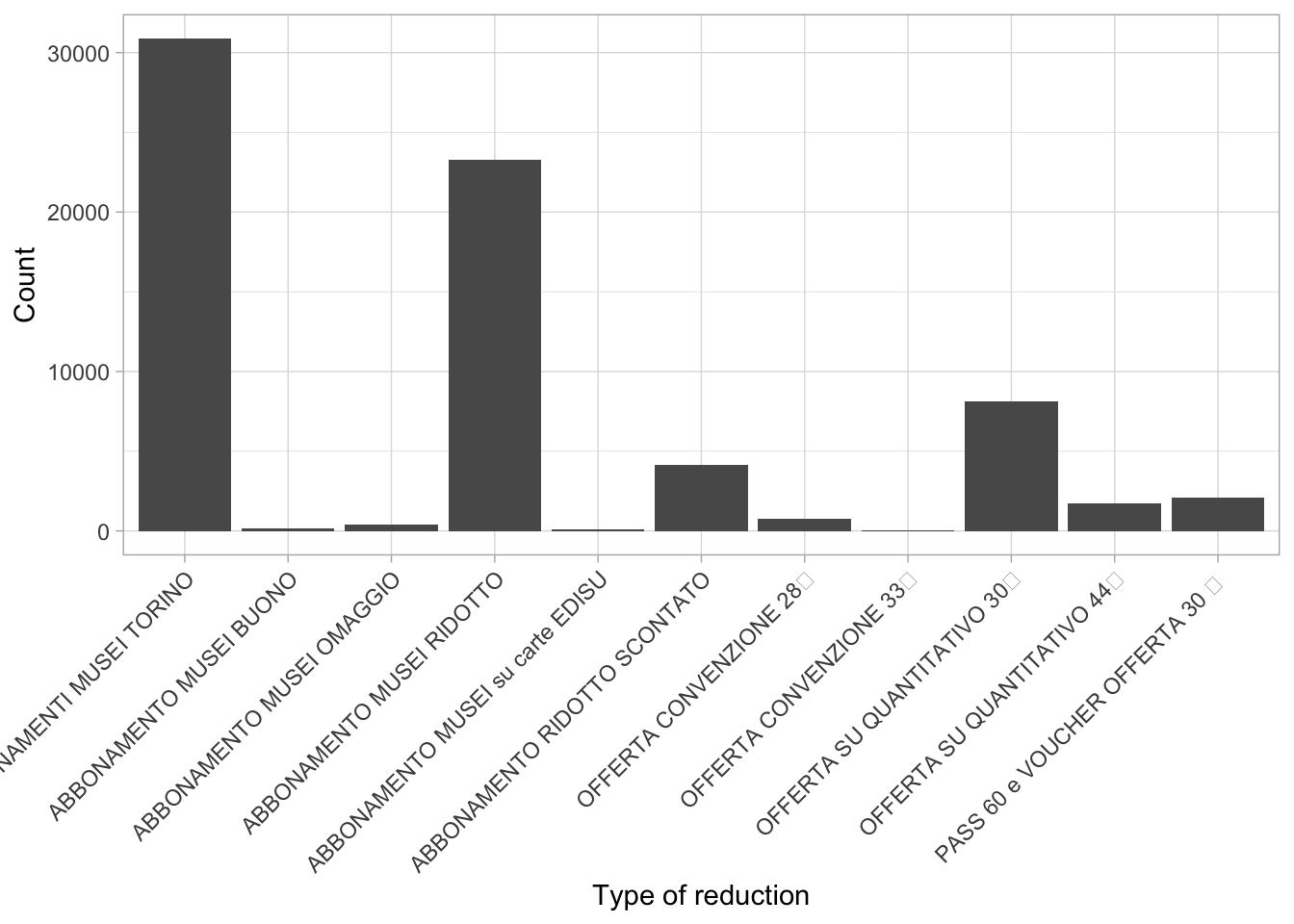
Figure 2.2: Clients per type of reduction
Considering these uncertainties, we focused our analysis on the different category of prices. There are 6 possible prices for the annual membership (0.00€, 10.00€, 49.00€, 30.00€, 28.00€, 44.00€). From Figure 2.3 it is possible to see that the majority of clients purchased subscriptions that costed 28.00€, 30.00€ or 44.00€. The clients that got the membership for free are less than 1%. The most sold was the 44.00€ membership, around 35% of total and the three most common membership’s prices account for around 85% of the total.
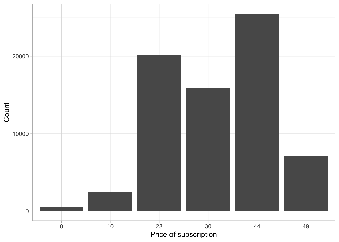
Figure 2.3: Clients per price of subscription
These memberships are sold by 141 agencies of 12 types. From Figure 2.4 it’s clear how the most used type of agency to buy the subscription is the information point, followed by the museum and CRAL (company “free time” association). Those make up more than 80% of all sales (more than 40% just from information points). Some agencies, like buyer groups and commercial points, are around 5%, while many are even less than 1%.
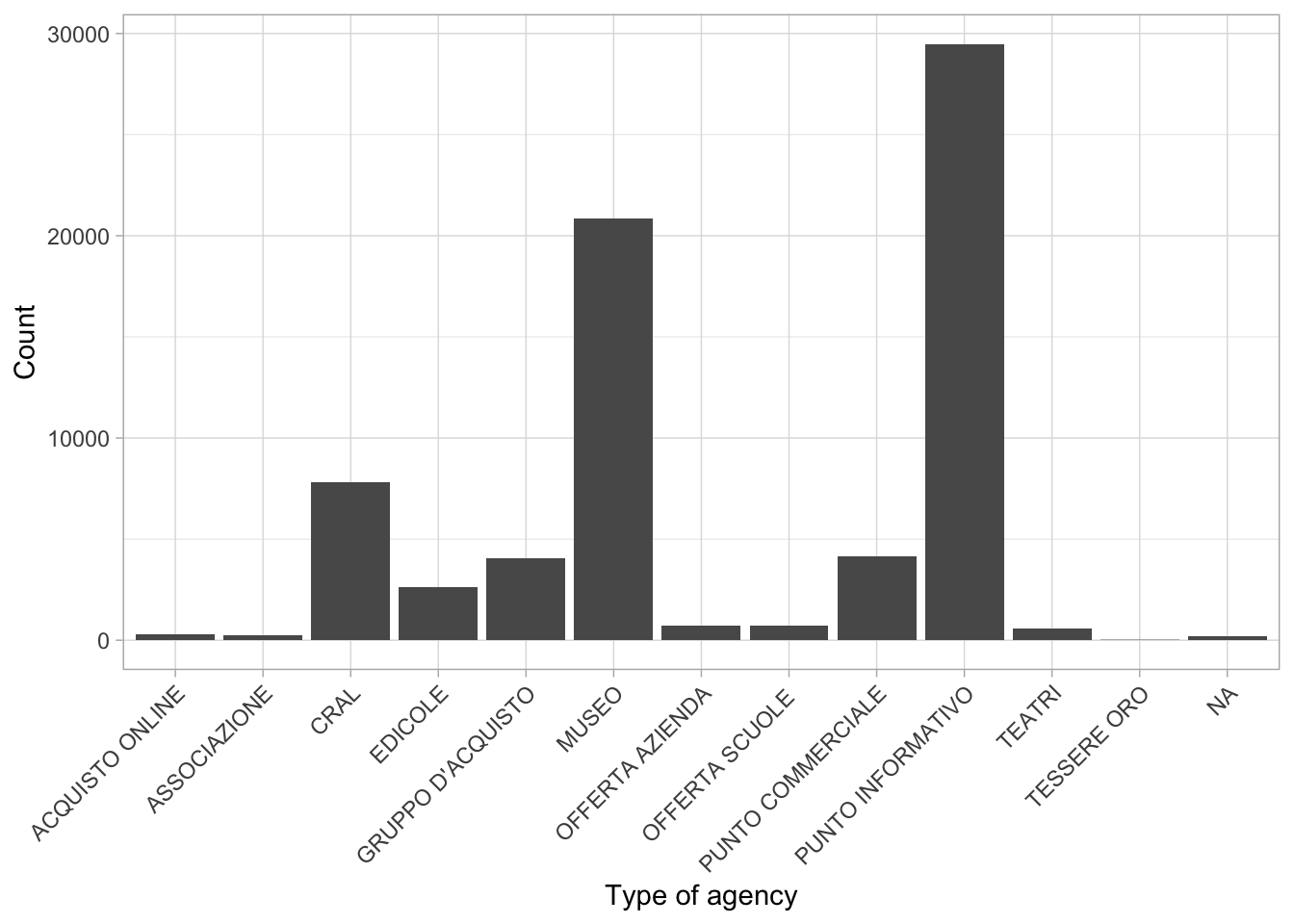
Figure 2.4: Clients per type of agency
2.4 Museum visits
The reference dataset in this case is “df_3”, from here we can derive information about the museums and single visits for each client. In total, there are 139 museums.
Considering we have information about individual visits, we investigated two main trends, in particular the hour of entrance and the month of the year. Figure 2.5 shows the distribution of the entrance during the day. As expected, clients tend to enter more in the first part of the morning and of the afternoon. There are some entrances also in the evening, we assumed that those could be related to evening exhibitions.
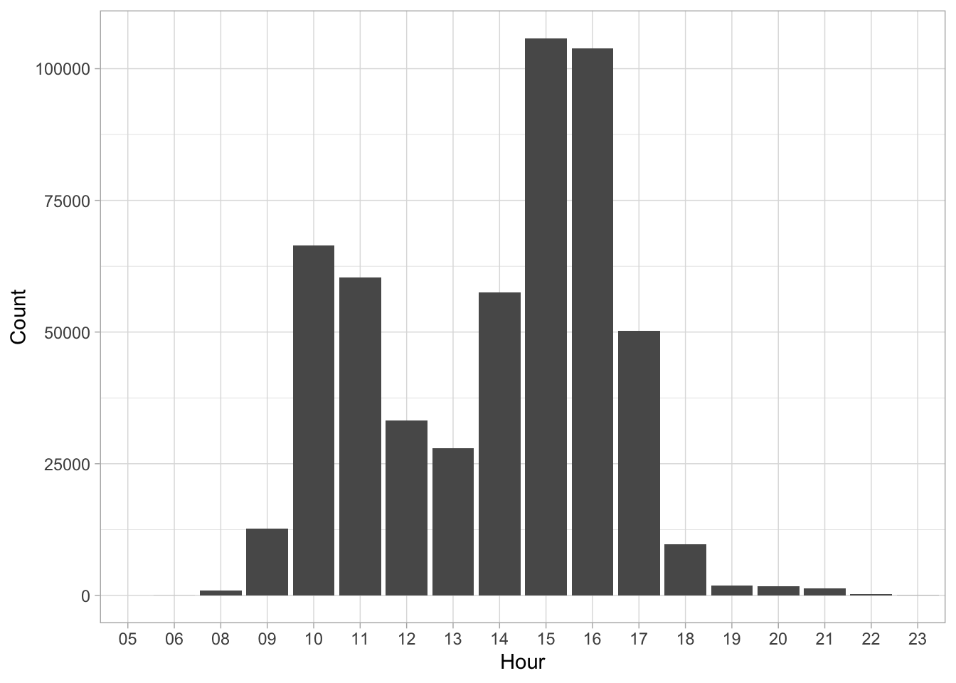
Figure 2.5: Hour of entrance
Figure 2.6 indicates the distribution of the visits during the months. Here we do not have all the data for the month of December, so it is not comparable with the other months.
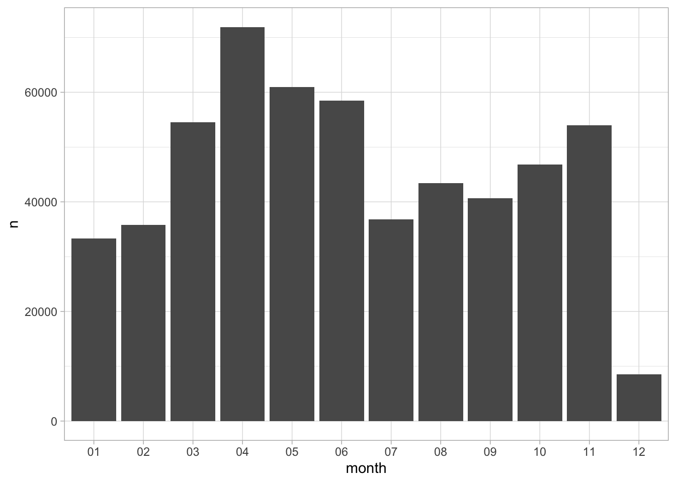
Figure 2.6: Number entrances per month
Lastly, it is interesting to see the distribution of how many clients did a certain number of visits. Figure 2.7 is a downward trend even though these are clients with a subscription that presumably allows for many visits.
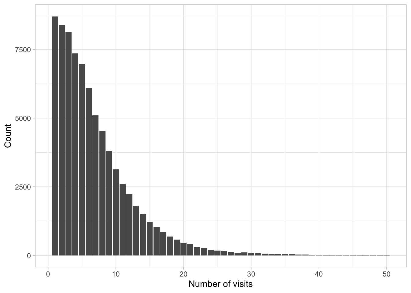
Figure 2.7: Number of clients per number of visits